
Author Kate Sparkes – Showing Up For Your Art Series, Part 2: Perfecting the Product
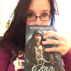
I recently had a chance to catch up with Kate Sparkes, author of the best-selling Bound Trilogy. I asked her a lot of questions, from how she shows up for her art, to how she prepares for launch, and even markets her book. Below, find part 2 of this 5-part series exploring how this talented author, who has managed to spin her dream of a full-time writing career into reality, shows up for your art. I hope you enjoy it!
If you haven’t read Kate’s work yet, well, get to it – you won’t regret it. Let’s begin with a little bio:
Kate Sparkes lives on the magical island of Newfoundland, where she’s always checking wardrobes, locked doors, and interesting caves to see whether they lead to new worlds. She passes the rest of her time hanging out with her family, reading, walking her dogs, and writing fiction that lets her come very close to escaping reality.
She likes sending treats to newsletter subscribers, so be sure to sign up for bonus content, sneak peeks, advance review copies, news about future books, contests, and more! Visit www.katesparkes.com for details.
Kate Sparkes on Showing Up For Your Art – Part 2: Perfecting Your Product
Laura: What’s your editing process like?
Kate: Draft. Let it sit. Revise as needed until it’s good. Read over. Critique partner(s). Revise again. Polish. Professional editor. Cry a bit when it comes back bleeding red from every page. Put big girl panties on. Revise. Polish. Read through. Beta readers. Corrections. Proof-read. Publish.
Laura: Do you hire an editor?
Kate: Yes. Even for the freebies I send out for subscribing to my newsletter. I only want my best work out there if I’m asking for money or trying to make a good impression on someone. Blog posts and freebie flash fiction on my blog can go without, though.
Laura: Do you have alpha and beta readers providing feedback as you’re readying your book?
Kate: I do! Usually two of each. Some are writers, some are “just” readers. I find it’s good to have both, as writers can get very technical in their critique while people who aren’t nit-picky about story structure and passive language are often really insightful pick out very different issues just based on gut reactions.
Laura: What’s the biggest challenge of the editing phase?
Kate: Making the big corrections after professional edits. I get content editing on everything, so the changes I’m making can be massive. Like, rewriting the entire climax massive. It’s daunting, and is only made worse by the fact that at that point it’s down to me and my beta readers to get this thing into shape. No more professional safety net.
Laura: How do you develop your cover concept? Do you know what you want and convey it to the artist, leave it to them, or take another approach entirely?
Kate: I’ve only worked with two artists so far (At Any Cost, my prequel novella, was a premade). For Bound, my first book, we had to do a lot of back and forth because I had no idea what I wanted or what would sell. Fortunately, I had a very patient and professional artist. For Torn and Sworn I still had to choose the stock art model I wanted to use and convey things like tone and such, but we had a definite look for the series in place. That made things so much easier! For Into Elurien I knew what I wanted. The artist had me choose and buy the stock art I liked, and there was some back and forth as we worked out the details, but it was basically up to me to tell her what I wanted.
Laura: How important would you say cover design is, in relation to book sales/success?
Kate: On a scale of 1-10? Maybe fifteen. I suspect that my cover art has done as much to sell my books as reviews and word of mouth have. If people see an appealing cover, they’ll want to know more. A crap book with a gorgeous cover might at least get people to read the product description and sample. A great book with a terrible cover won’t even get people that far.
Laura: Any advice on cover design that sells?
Kate: Work with an experienced artist. Not just in any art, but in cover art specifically. Listen to their advice on what sells, and look at other books that are ranking well in your genre to get a feel for what readers there like. You don’t want to copy anyone’s style, but fitting in visually isn’t a bad idea. People want to know what they’re getting before they click. Use your cover to make promises about the mood and feel of your book. That’s more important to me as a reader than whether your model looks exactly like the character on the page.
But I’m not an expert. That’s why I rely on people who are.
Laura: Any advice as to what to avoid in cover art?
Kate: I can only speak to that as a reader. I’ll walk away from any cover that looks like the author made it on his or her home computer. Things like oddly layered photo elements. Artwork that’s obviously not professionally done, whether that’s a computer generated image, a photo, or any other medium. Too-busy covers that overwhelm me and somehow still give me no idea of what’s going on. Lettering that looks slapped on as an afterthought or is unreadable. There may be a good book under there, but if the author didn’t invest in cover art, I’m going to assume they also didn’t invest in editing, and I probably won’t waste time clicking through for a sample.
That sounds harsh, and I know how expensive custom work can be. But a good premade cover can do more for a book than something less-than-professional but customized will. A cover is a first impression, and they matter.
Thanks so much, Kate! Click here to read the rest of the series: part 1 here, part 3 here, part 4 here, and part 5 here. You can check out some of Kate’s work for free – check out how: